
Visualizing Data (And it's easier said than done!)

Excel in its latest and greatest avatar has significantly improved upon the ability to create charts that:
Look respectable (think of the truly horrible grey background that charts had in Excel 2003 and earlier)
Convey meaningful information (the ability to create new kinds of charts has been added)
Can be interpreted easily (with color schemes and chart combinations that make sense!)
Still, given your data, creating a chart that is easy to read, conveys meaningful information and communicates a relevant message can be difficult. But hey, what are we here for? To make your Excel life as easy as possible, that’s what for! This particular Excel tutorial focusses on getting out that perfect chart – read on to find out more!
Take a look at the data given below:

Now, if you look at that table long enough, some things make themselves apparent. Jim, it would seem, is sheer awesomeness – highest sales by far. But hey, hang on a second, he’s not very efficient, is he? In fact, he needs to make a lot of calls, or sales visits, to get a succesful conversion.
And Peter – lowest sales on record, but what a salesman! He’s able to convert 95 times out of 100, and who wouldn’t want a batting average like that? Now, our problem is, can we put up a chart that tells this story effectively?
Well, creating a chart is simple enough – choose your data range, head on over to the Insert tab, and click a chart that catches your fancy – a bar chart would work well in this case.

Choosing the very first chart (first under 2D Columns) will give a chart that looks rather like this:

Which is well enough as things go, but there are a couple of problems. The first, and most obvious problem, is the fact that “% Successful Calls” is on the same vertical axis as “Sales”. Since sales are around the 200 mark (or thereabouts), and percentages are necessarily capped at 100%, well, “% Succesful Calls” variation doesn’t come across too well.
There’s a workaround though: right-click on the red bars, choose “Format Data Series”, and opt to have these bars shown on the “Secondary Axis”

Umm, whoops. That actually creates a secondary problem, as you can see in the chart below:

Fret not – there are a couple of ways to work around this problem. The first way is to right-click on the red bars, and increase the “Gap Width”. That’ll narrow the width of the red bars. Try it out and see!
But there’s a neater, nattier way of doing things. And here’s what you need to do.
Right-click on the red bars (this is getting slightly repetitive, we know. But trust us!) and select “Change Series Chart Type” – go in for the simplest line chart possible. Your chart should now look like this:
Much cleaner, wouldn’t you say?

Now right click on the legends that you see on the right, choose Format Legend and choose for them to be placed at the bottom. Why, do we hear you ask? Well, this way, you get more place for the stuff that matters – the data visualization itself.

Now, wouldn’t it be better if the blue bars themselves mentioned the value, rather than you having to guage it from the vertical axis on the left hand side? No problemo, amigo! Right click the blue bars, and choose “Add Data Labels”.

You could right-click the data labels themselves and choose for them to be placed “Inside Base”, so that they wouldn’t be on the top of the bar, but at the bottom. You could also choose (the last option in the column on the left in the pop-up) for them to be aligned using “Text Direction” – choose “Rotate All Text 270 degrees”.

Also, why not add data labels to the red line? One could do that the same way – only this time, let’s choose data alignment for the labels to be on “Above”. You chart should look like this now:

Much, much better – wouldn’t you say? But hey, why settle for better when best is around? You don’t really need the gridlines anymore, do you? Simply click on them, press delete, and voila – you have a cleaner, clutter-free chart. Also, let’s be honest – do you really need either vertical axis to be shown, now that the data is shown in the bars and along the lines? Right click on any number on both axes (one at a time) and choose format axis:

Set the options as shown, and within line color, choose “No Line”. Do this, as we said, for both axes.
I must say, we have a pretty nifty chart going here!

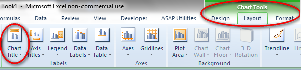
One last bit to go: Wouldn’t it be nice if we could tell the viewer of the chart what to look for – specifically, that there seems to be a payoff between Sales, and % Successful Calls? Well we could do that by adding a title to the chart – click on the chart (anywhere on the chart will do), go to the Layout tab in Chart Tools, and choose “Centered Overlay Title” under Chart Title:
Put in whatever title you wish, reduce the font size, and drag it to the top left of the chart – once you’re done with all of that – you’re chart is ready to go.
It’s been a long journey, we’ll be the first to admit. But have a look at the chart that we started with and the chart that we ended with. It’s been a worthwhile journey – and we hope you will not disagree!

Do let us know what you think – and hey, happy charting!

